This article was part of FORUM+ vol. 29 no. 1, pp. 22-27
Multi scripts - Blended type family stories
Lisa Huang 黄丽莎, Garine Gokceyan, Loraine Furter, Naïma Ben Ayed, Émilie Aurat
Multi Scripts – Blended Type Family Stories is a collective research-in-progress about multi-script typography. Partial and situated rather than universalist, it aims to be reflective, critical, speculative, and rich in proposals. It uses decolonial and feminist tools, it centres on diasporic experiences, pays attention to personal, professional, and family stories and anecdotes, to bring a contemporary reflection on multi-script typographic creation today.
Multiscripts – Familieverhalen in gemengde font is een lopend collectief onderzoek over multiscript typografie. Het is eerder partijdig en situationeel dan universalistisch bedoeld, en wil reflectief, kritisch en speculatief zijn met een rijkheid aan voorstellen. Het maakt gebruik van dekoloniale en feministische instrumenten, richt zich op diasporische ervaringen en besteedt aandacht aan persoonlijke, professionele en familiale verhalen en anekdotes. Zo wil het een actuele reflectie brengen van hedendaagse typografische creaties in multiscript.

The process of globalization in a post-colonial reality tends to generate uniformity at numerous levels. It standardizes cultures, ways of thinking and ways of seeing. As a central visual interface to culture, scripts — the visual representations of languages — are subject to this process. Latin, a globally successful script, has an outsize influence on the way languages are shaped and used, and its colonial heritage is reflected in its cultural and technological hegemony on a global scale. From the keyboards we type on, the way computers and (smart)phones encode characters, the way we transliterate languages(using another script to transcribe a language), the Latin script is always in the position of being the default in the different tools that shape communication today.
The hegemony of the Latin script influences the way letterforms of different writing systems are shaped and designed. In the world of typography, multilingualism often means having to deal with more than one script, and the term multi-script is used for typographic designs that contain several writing systems. The tools, trends, pedagogies and technologies that accompany the practice of type design are often based on placing the Latin script at the top of the ladder.
Northern-Western hegemony in design not only imposes very restricted standards of cultural so-called ‘universal’ (like the ‘international/Swiss style’) references, but also discredits more local references and writing systems. In most cases, commercial multi-script type design consists in adding scripts to typefaces primarily designed for Latin, imposing foreign and normative forms on cultures they are introduced into. This often unilateral process goes under the name ‘harmonization’ or ‘matchmaking’.

Yet, there are stories of resistance and coexistence that we would like to amplify and multiply. They bring necessary nuances to purity ideals and reductive binary views of 'good' or 'bad' practices. Like in diasporic or blended family stories, relations and attachments between people, cultures and scripts can be complex and rich in emotions. We are interested in unfolding these many relations and dimensions. When scripts coexist, we would like to observe how they coexist, ask what the terms and politics of this coexistence are, who sets them, and learn from these stories to build upon them.
The research we started is collective. It reflects our different positions and perspectives, as a group of five designers and researchers working in the field of typography: Émilie Aurat is a graphic designer and typographer who worked on Afáka, a Creole syllabary from Suriname, for the Missing Scripts program of the ANRT in Nancy. Garine Gokceyan is a Lebanese Armenian graphic designer, working between Brussels and Beirut, with Armenian, Latin and Arabic scripts. Lisa Huang 黄丽莎 is a type designer specialised in Latin and Chinese scripts, currently based in Paris. Loraine Furter is a graphic designer and researcher based in Brussels, reconnecting with her Armenian roots, currently transitioning from illiteracy in Armenian to becoming a multi-script being. Naïma Ben Ayed is French, with Tunisian heritage, London-based independent type and graphic designer, designing Arabic and Latin fonts.
We got together in September 2020 to exchange on our experiences around multi-script typography — a gathering that resulted in a series of presentations and a collective discussion, documented here. Since then, we decided to continue thinking and making things; together, and with the many people, designers, activists, and researchers engaging with these topics, whom are listed in a non-eshaustive way in this contribution.
Europe, where we are based, has its own rich and complex multi-script history; one of normalization and multi-layered transitions from one script to another. These histories are intermingled with smaller micro(hi)stories of personal trajectories, trans/inter-national migrations and second/third/fourth-generation diasporic existences. They shape typographic landscapes, with traces in the streets, on shop signs, and in more private environments.
Our intention is to research historical multi-script typographic objects (such as periodicals, street signs, ephemera, as well as our own family archives). We also would like to investigate the rules and regulations in place around the existence of such objects.
Where are these multi-script inscriptions traced, how and where are they recorded and archived?
This research also involves an investigation on terminology around multi-script typography. 'Harmonisation', 'Matchmaking', 'non Latin'… What is the history of those expressions in relation to design and how do they translate in different contexts and languages? What type of coexistence among scripts can we observe or imagine, which alternative power dynamics?
How can we rethink knowledge transmission and design processes in respect of differences and local specificities and allow for these alternative relations?
Our visual propositions are prompts for discussions.
Garine Gokceyan’s thoughts on her multi-script identity are conveyed in what follows. Coming from an Armenian family in Beirut, Lebanon; speaking and reading three different scripts and more languages is not unusual for her.
Multi-script practices are often tied with family trajectories. Languages can get lost from one generation to the other, and scripts even more, as languages can be transmitted through oral form. This 'knowledge' can become invisible, when experienced mostly in the private/domestic sphere. However, tangible or not, those inherited (hi)stories are valuable ways to connect and communicate.
As multi-script beings and designers, we carry our personal experience into our design work, and constantly doubt or question our knowledge, our opinions, the way we categorize languages and attribute them certain roles. How to use our subjectivity as an experimental tool to de-categorize, de-canonize our ways of thinking and seeing?
The way we choose fonts and layouts often feels like a statement.
To type different scripts in a digital environment, touchscreens’ digital keyboards are very helpful and more flexible than analogue ones. Because digital technologies were generally made with a Western/Latin mindset (from the code of the software to the urls and email addresses), the devices often lack multi-script support. Remember for instance the 12 keypads of the first mobile phones, which had 3 Latin letters associated with each numeric key and only Latin support. And still, today’s computer keyboards have about 80 to 100 keys, which is far from matching all writing systems.

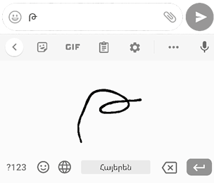


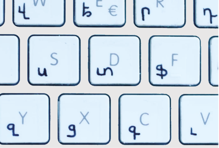
Writing systems that are more similar to Latin (Armenian, Cyrillic or Greek) benefit from a partial match and can coexist quite easily on the same keyboard. But even then, you might have to 'draw it yourself', like in this DIY bilingual Latin (French Switzerland)-Armenian keyboard.

When the keyboard is figured out, and you can start typing, the display of the text doesn’t always follow the script’s layout requirements:

One year girl, hands with pearl by Gao Yinxian (1902–1990)
Nüshu is a syllabic script derived from Chinese characters, created and used by women in a province of southern China as a tool of communication when reading and writing was forbidden or inaccessible for them. Its characters are usually written and read vertically, from top to bottom and from right to left.
As all digital devices are built and conceived with a Latin-alphabetical system in mind, with text from left to right and top to bottom, their structure does not fit well for scripts that don’t follow the same logic, such as Nüshu. For example, the smartphones with which we send messages are built with a vertical screen on which messages appear as paragraphs, horizontal blocks, one after the other. With a script like Nüshu, the paragraphs would be elongated rather than horizontal blocks, and users would scroll forever to read through a discussion. We still need to imagine ways to find a format, a layout, a structure that can work well for different scripts, without losing their original reading and writing directions — for instance with screen rotation?


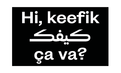
When the first mobile phones and online chats appeared, they came with the huge limitation of supporting only the Latin script. To be able to type on these devices, native users of different scripts across the world developed hacks to transliterate their language into the Latin alphabet.

Arabizi is the transliteration of Arabic language using the Latin script. Here, the Lebanese arabic sentence the sentence 'Ma ba2 7adan ye7keh 3anno!' is the Arabizi transliteration of !ما باء حداً يحكي عنّو and means 'No one should talk about him anymore!'. It uses Latin letters as well as numerals to cover the full Arabic alphabet. Letter haa ح for example is represented by number 7, letter ain ع is represented by number 3 and glottal stop hamza ء by number 2. Arabizi is not a standardized system and the meaning of letters/figures varies from one region to the other. Nowadays, although smartphones and computers support the Arabic script, Arabizi is still widely popular among Arabic speakers.
While transliteration is the use of a different alphabet to write a specific language; the process of 'romanization' indicates a transliteration into Latin letters. Arabizi is only one example of this phenomenon, born with early SMS and chat systems. A much older case is the romanization of the Chinese language by Jesuit missionaries in the 16-17th Centuries. Earlier Chinese transliteration systems like Pinyin are used in contemporary learning methods for kids in China today.

Currently going from Adlam to Zou, in the Latin alphabetic order, 'The World's Writing Systems' project, initiated by Johannes Bergerhausen and Jérôme Knebusch, is an example of an encyclopedic index of hundreds of writing systems. It sorts them in different categories such as: living or historical, and encoded in the Unicode standard (the main international scripts encoding standard), or not (yet), by name, time and region. The Decode Unicode and Missing Scripts fonts were designed for the equivalent of the 'A', 'K' or other representative glyph of each writing system that the project covers, in the proportions of Peter Biľak's Fedra Demi typeface, used for the (Latin) information about each writing system.
Noto is another example of a universalist project; a font family developed by Google with the aim to support ‘all languages in the world’. In the words of the project: 'Noto' means 'I write, I mark, I note' in Latin. The name is also short for 'no tofu', as the project aims to eliminate 'tofu': blank rectangles shown when no font is available for your text.
When a font doesn’t have a glyph in a specific script, it displays the '.notdef' glyph, , which often appears as an empty box, nicknamed 'tofu' based on the shape. The box sometimes contains an X or a question mark. An example of this: to this date, the Wikipedia page of Nüshu in English doesn’t display the scripts’ characters because of lack of font support, displaying instead those 'tofu' boxes…
This pangram mixing 3 languages and 2 scripts is an expression widely used in Lebanon and among the Lebanese diaspora. After the French protectorate from 1923 to 1943, the French language remained present in Lebanon; some words are pretty common in everyday language. English, as the language of the globalized and connected world is also present. Switching from one language to the other is a common phenomenon, especially in the capital, Beirut.
The development of scripts in Central and Southern Africa and African diaspora is often tied to strategies of survival and affirmation in a colonial context. Some were made by missionaries and colonists (the Medefaidrin, the Beria, the Kaddare, the Kpelle, the Osmanya…), others were created as a way to resist the colonialist erasure of local languages and to affirm their independence and cultural identity (the Bété, the Luo, the Bassa Vah, the Mwangwego…). A few existed before the colonial era and/or were influenced by writing systems that existed before this period. Some were appropriated by colonists for the purpose of translation, and thus banned by the native speakers (the Afáka).
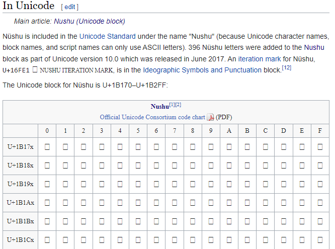
Screenshot of the Nüshu page on Wikipedia
The Mende scripts family is representative of Western Africa’s writing systems. Their creation was intended to bind a community together through its endogenous symbols, not to be shared with neighbouring communities.
The Mende script systems are directly related to the Vai script system, which leads to certain similarities and familiarities between them, although they were not designed with this in mind. Like most West African scripts, their creation is political: Kpelle was developed by King Gbili, the chief of Sanoyea in Liberia, to enhance the culture of the Kpelle people. The Bassa Vah is the result of the need to avoid slave traders. Its extinction is due to its prohibition by the colonial powers. The Medefaidrin and the Afáka were appropriated by Western religious authorities to spread the Bible among the population.
Even if the Mende scripts are not so much influenced by each other, they have a lot in common, like their context of creation (the traditional or pre-Islamic origins of some glyphs, their creation made by a male member of the population who claimed to have been inspired by a dream, vision, or nocturnal revelation, their banning for political reasons), and a lot of identical ideograms and pictograms (David Dalby, Africa and the Written Word, 1986). The initiatic and private dimensions of their spread does not allow them to be in multi-script compositions, and we rarely find them in the same documents. However, these different scripts are regularly assembled in theoretical (Western) documents with the aim to compare their forms, their readings, their pronunciations...

Andre R.M. Pakosie, 1999, “Het Afákaschrift Van De Tapanahoni In Suriname”, Bronnen Voor De Studie Van Suriname CLACS-IBIS, Utrecht, 1999, p. 32.
A more recent story of emancipation through a writing system is the story of the Adlam, created at the end of the 1980s by two young Guinean brothers – Abdoulaye and Ibrahima Barry – to write their native language, Fulani. The Fulani language is spread over twenty countries in Western and Central Africa, travelling with its nomadic people, and at the time it didn’t have its own script and was often written with the Arabic or Latin script, which couldn’t accurately transcribe Fulani words and their particular sounds. Abdoulaye and Ibrahima Barry’s father was often reading Fulani letters written in Arabic to help his neighbours, but the task was difficult, and his sons decided to create a specific script for the language: Adlam.
In the field of design, working with multiple scripts is a real challenge. There is a real lack of references and script specific publications, websites and conferences, other than Latin, are rare.
Tools and softwares to use and design fonts are inadequate for certain scripts. Designing fonts for Chinese/Japanese/Korean scripts is particularly difficult, because type design tools are made for the Latin script and thus requires workarounds, bidouillages, to adapt them to scripts that have a completely different structure.
The Latin script is composed of detached letters. The combination of those letters with different diacritics (accents for example) covers many words and languages. While in Chinese, to put it simply, one character = one word. A complete font in Latin script contains about 400 glyphs in total (including figures, punctuations, etc.) while in Chinese, the number of needed glyphs in a font goes between 7500 to 27500 for it to be usable. This was already a major issue at the times of metal type printing. Imagine finding a specific character in a room of several thousands of cases filled with small pieces of lead...
In today's post-digital era, the issue of producing fonts in Chinese still exists. It takes much more time (and finances) to design and produce a font in Chinese than in any other script, which creates a huge gap between the Chinese and the Latin type market, while the demand has never been higher…
For different reasons, several scripts have very few typefaces. For example Tifinagh, because it became an official writing system in Morocco and Algeria only over the last few years.
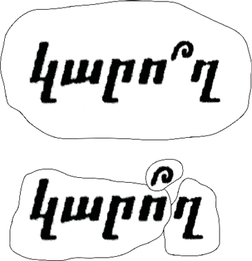
The Armenian script isn't very well documented and there is a lack of Armenian typographic rules. For instance, where to put the question mark is a real interrogation, relayed by the (small) community of Armenian (even smaller) type designers. Should the Barouyg (Armenian question mark) be on the vowel or next to it ? Who decides ?
+++
Lisa Huang 黄丽莎
is a type designer specialised in Latin and Chinese scripts, currently based in Paris, France. Her interest in type and typography focuses on multi-cultural works, especially those mixing Latin-French and Chinese writing systems, which mirrors her life as a multicultural human. She has lately worked on the digitisation of Nüshu script to join Noto Sans typeface family.
Garine Gokceyan
is an independent graphic designer based in Brussels and born in Beirut, working on multidisciplinary pedagogic and social projects using Armenian, English, French and Arabic languages. She received a Master’s degree in Visual Communications from l’École Nationale Supérieure des Arts Visuels of La Cambre, Brussels in June 2017 and a Teaching Diploma in Fine Arts from ENSAV, La Cambre, Brussels in 2018.
Loraine Furter
is a graphic designer based in Brussels, specialized in hybrid publishing (paper and digital publications), graphic design research, and intersectional feminist projects. Loraine has a Master in typography (erg, Brussels) but considers herself more as a contributor to collective and Open Source projects. Loraine is currently a PhD student at Sint Lucas Antwerp, where she continues a self-initiated research project entitled Speaking Volumes — art, activism and feminist publishing.
Naïma Ben Ayed
is a London (UK) based independent type and graphic designer from France, with Tunisian heritage, working with/in between the Arabic and Latin scripts. On-going interests and research are situated somewhere at the intersection of type design, language, archive and storytelling. She explores those connections through both her design practice and collaborations as well as through regular workshops she leads.
Émilie Aurat
is a graphic designer and typographer based in Nancy. In 2018 she worked on Afàka, a XXth century syllabary for the Ndyuka language, an English-based creole of Suriname, as part of the Missing Scripts program of the ANRT in Paris.
COMPLEMENTARY RESOURCES AND PROJECTS
― Beatriz Lozano, Multiscriptual Typesetting, Alphabettes, 2019.
― Clara Balaguer, Hardworking Goodlooking, Office of Culture and Design, Filipino Type Foundry.
― Ksenya Samarskaya, Nontsikelelo Mutiti on Interrogating the Euro-centric Design Canon, AIGA Eye on Design, 2019.
― Montasser Drissi, À quoi doit ressembler un Alef ?, Qalqalah, 2016.
― Rachel So Dam Jung, The Interlocality of Typography — A conversation with Yu Jiwon about the suggestions of typographic diversity in so ciety and culture, Futuress, 2021.
― Sahar Afshar, Through the Typographic Looking Glass: Reflections on the Concept of “Decentralizing” Type, Typegeist, 2018.
― Slavs and Tatars, Transliterative Tease, 2013–present.
...
?
Type Colophon: Abhaya Libre Latin by Sol Matas · Neue Haas Unica by Toshi Omagari and Team ’77 · Spaghetti by Morgane Le Ferec & Garine Gokceyan · Noto Sans Nüshu by Lisa Huang · IBM Plex Sans Arabic by Khajak Apelian and Wael Morcos · Authentic Sans by Christina Janus and Desmond Wong · Al Bayan · Pinyon Script by Nicole Fally · DejaVu · La Grotesque by La Bureau, release coming in 2022 · MissingScripts by J. Bergerhausen, Arthur Francietta and Morgane Pierson.

